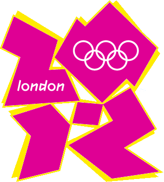
 It’s controversial, but at least it’s designed on mathematical shapes. I like it, but it seems few do and there is a petition to have it replaced! Could your children have done better – after all, it has cost £500 000 to produce.
Maths help for parents of children aged 5 to 11
It’s controversial, but at least it’s designed on mathematical shapes. I like it, but it seems few do and there is a petition to have it replaced! Could your children have done better – after all, it has cost £500 000 to produce.
I really do not like it. Is it the best we can come up with? No!
The logo they had when competing to host the Olympics was much better – why didn’t we stick with that and use the money to help train athletes who might have a chance of winning?