Pie charts are a good way to illustrate the proportion of a whole amount or quantity. The arc length of each sector or the sectors area is proportional to the quantity it represents. This might sound a little tricky, but pie charts can be effective in displaying information.
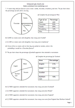
This worksheet looks at a pie chart where the percentages have also been given. This allows for numbers to be worked out if the total number is given. The first pie chart looks at ice cream sales and the second looks at football supporters attending a tournament.
