Maths worksheet: the triple jump

The Triple Jump is a fascinating event, combining great athleticism with co-ordination. Originally known as the hop, step and jump it is an excellent activity to carry out with children using a standing start rather than a run up. The American, James Connolly was one of the early competitors, winning in Athens in 1896.

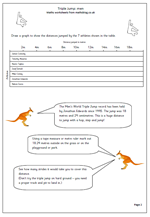
Triple jumpers take off on the ‘hop’ stage and land on the same foot. They then take one step onto the other foot before a final jump, landing with two feet into the sand. The rules concerning the landing are the same as for the long jump with the nearest mark to the board being the distance measured.

The distances jumped really are amazing and it is well worth marking out on a field exactly how far they jump. For example our greatest triple jumper, Jonathan Edwards holds the World Record with a jump of 18 metres and 29 centimetres.

The worksheet looks at some of the greatest ever winners of the Triple Jump as well as completing a graph showing the distances jumped and would be best suited to upper primary children and can be found in our Year 5 Handling Data section.
Triple jump men

Year 5 Line Graphs

With a lovely hot summer ahead of us what better way to spend a maths lesson than looking at line graphs of temperatures?

In year 5 children are expected to construct and interpret line graphs. The important aspect of a line graph is that each point on the line will have a value. The graph on this worksheet shows the minimum and maximum temperatures each month for London. It would be well worth finding other temperature graphs for cities around the world and comparing them.

Another great idea is to find data for countries in the southern hemisphere and compare the shape of the line graph to London.

Why not go to our Handling data and probability page for year 5?

Year 4 Handling Data: information from a table

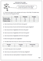
As adults we read and interpret information from tables and charts almost on a daily basis, but children need practice at this. To answer the questions on this worksheet children have to understand the layout of the table and interpret the figures. It also needs a nifty bit of adding three numbers, so jottings might well be the order of the day.

This worksheet can be found in our Year 4 Handling Data category.

Information from a table

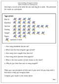
Resource of the Week: Pictogram of birds (year 4)

pictogram-birds

Here we have another in our series of data handling worksheets for year 4. Each bird on the pictogram represents 5 birds. This page is a starter to show children how to complete and interpret a pictogram so that they can go on to create their own. In this case more information about the most common birds in the garden can easily be found on the internet and a hypothesis can be made as to whether a local survey would give similar results.

Pictogram: birds in the garden

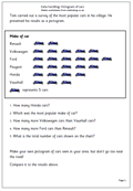
Resource of the week: Year 4 pictogram

pictogram-cars

Graphs are often perceived as a quite easy part of maths, but many children find interpreting them correctly quite tricky. This page looks at the most popular cars seen in a village. Each picture of a car represents 5 cars. Again this page should be seen more as a starter to go and collect data themselves and make their own pictograms.  Problems might arise when the data is not in whole fives or tens. This can be solved by showing part of a car eg a wheel could represent one car. This would need to be shown clearly on the pictogram.

This and other handling Data activities can be found in our Year 4 resources.

Pictogram: most popular cars

Year 6 maths worksheet: Interpret pie charts

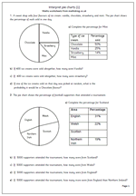
Pie charts are a good way to illustrate the proportion of a whole amount or quantity. The arc length of each sector or the sectors area is proportional to the quantity it represents. This might sound a little tricky, but pie charts can be effective in displaying information.

This worksheet looks at a pie chart where the percentages have also been given. This allows for numbers to be worked out if the total number is given. The first pie chart looks at ice cream sales and the second looks at football supporters attending a tournament.

Pie chart (1)

Year 5 handling data: weather graph 2

It’s still lovely and sunny here and just as hot as it is in Paris.

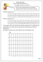
Here we have a follow up page for the worksheet posted yesterday. Yesterday’s page concentrated on interpreting the data on a graph already drawn. Today’s worksheet gives the data and asks for a graph to be drawn. This can either be done on the chart provided, or to make it harder, using graph paper and children decide on the scale to use themselves.

The data provided is the average minimum and maximum monthly temperatures for Paris. A further exercise could be to compare the graph’s of London and Paris.

Weather chart (2)

Year 5 handling data: weather graph

It’s lovely and sunny here, so what better than a weather chart to brighten the day even further!

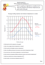
This worksheet shows a weather graph of the average maximum and minimum temperatures for each month of the year for London. It is typical of many found on weather sites on the internet, holiday brochures and newspapers. It is well worth reminding children that a graph should always have a clear title, and the axes labelled.

Some children have problems interpreting the scales on graphs when they don’t go up in single figures so it is important to point out what the temperature scale is. Most suited to year 5.

A follow up page to this will be published tomorrow.

Weather chart (1)

Coming soon: Handling data

Next week is very much a Handling Data week for older children. We will have two quite tricky weather graphs for Year 5 and some pie chart work for Year 6.

The weather graphs will show the average maximum and minimum temperatures for each month of the year for different places. It is typical of many found on weather sites on the Internet, holiday brochures and newspapers. It is surprising how often children ‘mess up’ with graph work, especially when labelling axes and interpreting the scales correctly.

Pie charts are not my favourite way of displaying data as they can often be misrepresented in the press. It is important to realise that they are only useful when comparing a slice to the whole pie, not comparing slices to different pies.

Year 1 Maths worksheet: Handling data and sorting shapes

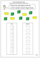
One of the earliest stages of data handling is to be able to sort and a lot of practical work can be done, such as tidying up a drawer of pens, pencils, paper clips etc.

The next stage is to be able to record the results and here we have a simple page where the two sets of shapes can be sorted and recorded on the columns.

The outlines of the cylinders and cubes are provided and it is just a matter of counting the number of each shape and recording by colouring the correct number on the columns.

This page can be found in our Handling Data section for Year 1.

Sorting shapes 1