Year 3 graphs

I have published a page on graphs for year 3 children today; thanks to urbrainy for this resource. The main difference with data handling from year 2 to year 3 is that the reading divisions becomes harder as they may no longer go up in ones. Hence children are having to find numbers half way between two others.

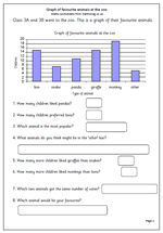
This graph looks at interpreting the data of a graph showing the most popular zoo animals. The second page  shows a blank tally chart so that children can collect their own data and then create their own graph.

Zoo animals graph

Year 3 graphs

There are two main aspects to graphical work, one is to collect and organise data and the other is to interpret the results whether shown as a graph, pictogram etc.

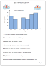
This page looks at interpreting a bar chart showing the number of packets of crisps sold by a corner shop over the course of a week. One of the main concepts here is that the vertical axis is labelled in twos rather than just going up in ones. This means that children must be able to read from unlabelled axes for the first time.

There are plenty of simple calculations here with questions such as, ‘How many more packets of crisps were sold on Sunday than on Friday?’ but there are also questions to make children think a little more carefully about what the bar chart is showing. These are more open ended, with no one correct answer and are good starting points for discussion.

Bar charts


Resource of the Week: Weather chart

It’s lovely and sunny here and the Olympics are well under way, so what better than a weather chart to brighten the day even further!

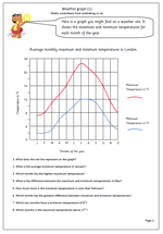
This worksheet shows a weather graph of the average maximum and minimum temperatures for each month of the year for London and shows just why August is a pretty good month to hold a sports competition. It is typical of many found on weather sites on the internet, holiday brochures and newspapers. It is well worth reminding children that a graph should always have a clear title, and the axes labelled.

Some children have problems interpreting the scales on graphs when they don’t go up in single figures so it is important to point out what the temperature scale is. Most suited to year 5.

Weather chart (1)

Key Stage 2 Maths SAT practice: graphs (4)

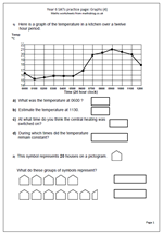
This worksheet is another in our series on the types of questions that come up on the SAT papers. It is another on graphs, but quite a lot harder. The first part of the worksheet looks at a line graph showing temperatures in a kitchen over a 12 hour period.A key difference between this and other graphs is that every point on the line has a value even between the hours marked.

As well as reading times from the graph it also asks the question, ‘At what time do you think the central heating was switched on?’ This involves interpreting the question and assuming that switching on the central heating would lead to a rise in temperature. Given that it would take a little while for the radiators to warm up it would seem that 0500  would be a good answer. Times either side of this could also be given as correct.

The second part of the worksheet looks at a pictogram, where each symbol represents 20 houses. Again, this is a common type of question that children should have met many times before and should not cause any problems.

Graphs (4)

Year 6 SATs practice: graphs (3)

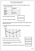
Here is the next in our mini series of maths worksheets looking at the types of questions involving graphs that come up in the SAT papers. The first part of the worksheet looks at interpreting a tally chart. Children should have had plenty of practice with making and interpreting tally charts from year 2/3 onwards so this should be a very simple  question.

The second part of the worksheet is harder, with questions on a line graph. The scale goes up in hundreds and there needs to be a reasonable amount of leeway in the answers given.

This page can be found in the Year 6 maths worksheets category, under Key Stage 2 Maths SAT practice, together with other pages on number, time and shape. Also don’t forget to take a look at Year 6 Maths SAT Papers where you will find lots more questions taken from recent test papers plus ways to approach them.

Graphs (3)

Year 6 SATs practice: Graphs (1 and 2)

It is not too long now before the latest round of Year 6 SATs comes so I thought I would put a week aside to provide worksheets to help with this.

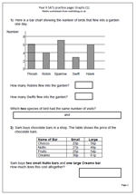
Today I have published a page which looks at the type of question which comes up on interpreting bar charts. A bar chart shows the number of birds that flew into a garden on one day. It is very straightforward, with the numbers on the axis going up in twos.

The second part of the page looks at using a table to find information and the question asks how much two Nutto bars and one Creamo bar would cost. The first step is to find the correct prices and then work out the cost. Two bars at 27p and one at 61p can be added in several ways. For example:

The 27p can be doubled to make 54p and then the 61p added to make 115p or £1.15 or

27p can be added to 61p to make 88p and then add 27p.

The second page is similar, this time looking at a temperature graph and a frequency of throwing dice graph.

These worksheets can be found in the Year 6, Key Stage 2 Maths SAT practice category.

Graphs (1)

Graphs (2)
 

Year 2 maths worksheet: graphs

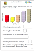
Here is one of the superb sets of year 2 maths worksheets which URBrainy.com have allowed me to publish. It is suitable for 6/7 year old children who are just beginning to understand and interpret block graphs and it looks at the favourite sandwich fillings of a class:- always a popular subject.

The first page involves interpreting the results of the graph, whilst the second page is a template which can be printed and used by the child to show the results of their own survey.

it is well worth going to URBrainy as a simple log in process allows access to all their resources for a week as well as printing up to ten sets of worksheets. If you are looking for full and detailed coverage of Key Stage 1 then I can highly recommend this.

Sandwich graph