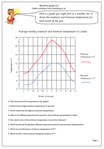
It’s lovely and sunny here, so what better than a weather chart to brighten the day even further!
This worksheet shows a weather graph of the average maximum and minimum temperatures for each month of the year for London. It is typical of many found on weather sites on the internet, holiday brochures and newspapers. It is well worth reminding children that a graph should always have a clear title, and the axes labelled.
Some children have problems interpreting the scales on graphs when they don’t go up in single figures so it is important to point out what the temperature scale is. Most suited to year 5.
A follow up page to this will be published tomorrow.

I would like to compare snowfall in 2011, and 2010 to the 5 year average