It’s still lovely and sunny here and just as hot as it is in Paris.
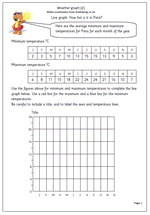
Here we have a follow up page for the worksheet posted yesterday. Yesterday’s page concentrated on interpreting the data on a graph already drawn. Today’s worksheet gives the data and asks for a graph to be drawn. This can either be done on the chart provided, or to make it harder, using graph paper and children decide on the scale to use themselves.
The data provided is the average minimum and maximum monthly temperatures for Paris. A further exercise could be to compare the graph’s of London and Paris.
