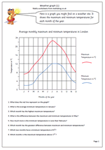
With a lovely hot summer ahead of us what better way to spend a maths lesson than looking at line graphs of temperatures?
In year 5 children are expected to construct and interpret line graphs. The important aspect of a line graph is that each point on the line will have a value. The graph on this worksheet shows the minimum and maximum temperatures each month for London. It would be well worth finding other temperature graphs for cities around the world and comparing them.
Another great idea is to find data for countries in the southern hemisphere and compare the shape of the line graph to London.
Why not go to our Handling data and probability page for year 5?
